Download Developing Mobile Apps.70-357.TestKing.2017-12-21.51q.vcex
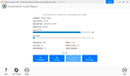
| Vendor: | Microsoft |
| Exam Code: | 70-357 |
| Exam Name: | Developing Mobile Apps |
| Date: | Dec 21, 2017 |
| File Size: | 6 MB |
How to open VCEX files?
Files with VCEX extension can be opened by ProfExam Simulator.
Discount: 20%

Demo Questions
Question 1
You need to implement the appropriate XAML layout for the Timeline app.
Solution: You create an instance of a StackPanel class.
Does this meet the goal?
- Yes
- No
Correct answer: B
Explanation:
StackPanel is a simple layout panel that arranges its child elements into a single line that can be oriented horizontally or vertically. StackPanel controls are typically used in scenarios where you want to arrange a small subsection of the UI on your page. The following XAML shows how to create a vertical StackPanel of items. XAML <StackPanel> <Rectangle Fill="Red" Height="44"/> <Rectangle Fill="Blue" Height="44"/> <Rectangle Fill="Green" Height="44"/> <Rectangle Fill="Orange" Height="44"/> </StackPanel> The result looks like this. Reference: https://docs.microsoft.com/en-us/windows/uwp/layout/layout-panels StackPanel is a simple layout panel that arranges its child elements into a single line that can be oriented horizontally or vertically. StackPanel controls are typically used in scenarios where you want to arrange a small subsection of the UI on your page.
The following XAML shows how to create a vertical StackPanel of items.
XAML
<StackPanel>
<Rectangle Fill="Red" Height="44"/>
<Rectangle Fill="Blue" Height="44"/>
<Rectangle Fill="Green" Height="44"/>
<Rectangle Fill="Orange" Height="44"/>
</StackPanel>
The result looks like this.

Reference: https://docs.microsoft.com/en-us/windows/uwp/layout/layout-panels
Question 2
You need to implement the appropriate XAML layout for the Timeline app.
Solution: You create an instance of a RelativePanel class.
Does this meet the goal?
- Yes
- No
Correct answer: A
Explanation:
RelativePanel lets you layout UI elements by specifying where they go in relation to other elements and in relation to the panel. By default, an element is positioned in the upper left corner of the panel. Reference: https://docs.microsoft.com/en-us/windows/uwp/layout/layout-panels RelativePanel lets you layout UI elements by specifying where they go in relation to other elements and in relation to the panel. By default, an element is positioned in the upper left corner of the panel.
Reference: https://docs.microsoft.com/en-us/windows/uwp/layout/layout-panels
Question 3
You need to implement the appropriate XAML layout for the Timeline app.
Solution: You create an instance of a SplitView control.
Does this meet the goal?
- Yes
- No
Correct answer: B
Explanation:
A split view control has an expandable/collapsible pane and a content area. Here is an example of the Microsoft Edge app using SplitView to show its Hub. Reference: https://docs.microsoft.com/en-us/windows/uwp/controls-and-patterns/split-view A split view control has an expandable/collapsible pane and a content area.
Here is an example of the Microsoft Edge app using SplitView to show its Hub.

Reference: https://docs.microsoft.com/en-us/windows/uwp/controls-and-patterns/split-view
Question 4
You need to create the user interface for the timeline.
Which four markup segments should you use to develop the solution? To answer, move the appropriate markup segments from the list of markup segments to the answer area and arrange them in the correct order.
NOTE: More than one order of answer choices is correct. You will receive credit for any of the correct orders you select.
Correct answer: To work with this question, an Exam Simulator is required.
Explanation:
Box 1: <Commandbar>Command bars (also called "app bars") provide users with easy access to your app's most common tasks, and can be used to show commands or options that are specific to the user's context, such as a photo selection or drawing mode. They can also be used for navigation among app pages or between app sections. Command bars can be used with any navigation pattern. XAML provides both the AppBar control and the CommandBar control. You should use the AppBar only when you are upgrading a Universal Windows 8 app that uses the AppBar, and need to minimize changes. For new apps in Windows 10, we recommend using the CommandBar control instead. Box 2: <AppBarButton .. etc.The CommandBar control is a general-purpose, flexible, light-weight control that can display both complex content, such as images or text blocks, as well as simple commands such as AppBarButton, AppBarToggleButton, and AppBarSeparator controls. Box 3: <CommandBar.SecondaryCommands> etc.The overflow menu is shown only when the command bar is open and the SecondaryCommands property is populated. The new dynamic overflow behavior will automatically move primary commands into the SecondaryCommands area when space is limited. Box 4: </Commandbar>Example: Here is a same command bar in its open state. The labels identify the main parts of the control. This example creates the command bar shown above. <CommandBar> <AppBarToggleButton Icon="Shuffle" Label="Shuffle" Click="AppBarButton_Click" /> <AppBarToggleButton Icon="RepeatAll" Label="Repeat" Click="AppBarButton_Click"/> <AppBarSeparator/> <AppBarButton Icon="Back" Label="Back" Click="AppBarButton_Click"/> <AppBarButton Icon="Stop" Label="Stop" Click="AppBarButton_Click"/> <AppBarButton Icon="Play" Label="Play" Click="AppBarButton_Click"/> <AppBarButton Icon="Forward" Label="Forward" Click="AppBarButton_Click"/> <CommandBar.SecondaryCommands> <AppBarButton Icon="Like" Label="Like" Click="AppBarButton_Click"/> <AppBarButton Icon="Dislike" Label="Dislike" Click="AppBarButton_Click"/> </CommandBar.SecondaryCommands> <CommandBar.Content> <TextBlock Text="Now playing..." Margin="12,14"/> </CommandBar.Content> </CommandBar> Reference: https://docs.microsoft.com/en-us/windows/uwp/controls-and-patterns/app-bars Box 1: <Commandbar>
Command bars (also called "app bars") provide users with easy access to your app's most common tasks, and can be used to show commands or options that are specific to the user's context, such as a photo selection or drawing mode. They can also be used for navigation among app pages or between app sections. Command bars can be used with any navigation pattern.
XAML provides both the AppBar control and the CommandBar control. You should use the AppBar only when you are upgrading a Universal Windows 8 app that uses the AppBar, and need to minimize changes. For new apps in Windows 10, we recommend using the CommandBar control instead.
Box 2: <AppBarButton .. etc.
The CommandBar control is a general-purpose, flexible, light-weight control that can display both complex content, such as images or text blocks, as well as simple commands such as AppBarButton, AppBarToggleButton, and AppBarSeparator controls.
Box 3: <CommandBar.SecondaryCommands> etc.
The overflow menu is shown only when the command bar is open and the SecondaryCommands property is populated. The new dynamic overflow behavior will automatically move primary commands into the SecondaryCommands area when space is limited.
Box 4: </Commandbar>
Example: Here is a same command bar in its open state. The labels identify the main parts of the control.

This example creates the command bar shown above.
<CommandBar>
<AppBarToggleButton Icon="Shuffle" Label="Shuffle" Click="AppBarButton_Click" />
<AppBarToggleButton Icon="RepeatAll" Label="Repeat" Click="AppBarButton_Click"/>
<AppBarSeparator/>
<AppBarButton Icon="Back" Label="Back" Click="AppBarButton_Click"/>
<AppBarButton Icon="Stop" Label="Stop" Click="AppBarButton_Click"/>
<AppBarButton Icon="Play" Label="Play" Click="AppBarButton_Click"/>
<AppBarButton Icon="Forward" Label="Forward" Click="AppBarButton_Click"/>
<CommandBar.SecondaryCommands>
<AppBarButton Icon="Like" Label="Like" Click="AppBarButton_Click"/>
<AppBarButton Icon="Dislike" Label="Dislike" Click="AppBarButton_Click"/>
</CommandBar.SecondaryCommands>
<CommandBar.Content>
<TextBlock Text="Now playing..." Margin="12,14"/>
</CommandBar.Content>
</CommandBar>
Reference: https://docs.microsoft.com/en-us/windows/uwp/controls-and-patterns/app-bars
Question 5
You need to design the navigation for the timeline.
What navigation should you use?
- hierarchy
- peer
- hub
- master/details
Correct answer: A
Explanation:
From scenario:Each item in the past must be linked to the next item in the future. Users must be able to scroll from past events to future events or from future events to past events. The app must only allow one level of detail to be linked to each item in the timeline. Here we can use a hierarchy with each parent node having only one single child node. Hierarchical structures are good for organizing complex content that spans lots of pages or when pages should be viewed in a particular order. The downside is that hierarchical pages introduce some navigation overhead: the deeper the structure, the more clicks it takes for users to get from page to page.We recommend a hiearchical structure when:You expect the user to traverse the pages in a specific order. Arrange the hierarchy to enforce that order. There is a clear parent-child relationship between one of the pages and the other pages in the group. There are more than 7 pages in the group. When there are more than 7 pages in the group, it might be difficult for users to understand how the pages are unique or to understand their current location within the group. If you don't think that's an issue for your app, go ahead and make the pages peers Reference: https://docs.microsoft.com/en-us/windows/uwp/layout/navigation-basics From scenario:
- Each item in the past must be linked to the next item in the future.
- Users must be able to scroll from past events to future events or from future events to past events.
- The app must only allow one level of detail to be linked to each item in the timeline.
Here we can use a hierarchy with each parent node having only one single child node.
Hierarchical structures are good for organizing complex content that spans lots of pages or when pages should be viewed in a particular order. The downside is that hierarchical pages introduce some navigation overhead: the deeper the structure, the more clicks it takes for users to get from page to page.
We recommend a hiearchical structure when:
You expect the user to traverse the pages in a specific order. Arrange the hierarchy to enforce that order.
There is a clear parent-child relationship between one of the pages and the other pages in the group.
There are more than 7 pages in the group.
When there are more than 7 pages in the group, it might be difficult for users to understand how the pages are unique or to understand their current location within the group. If you don't think that's an issue for your app, go ahead and make the pages peers
Reference: https://docs.microsoft.com/en-us/windows/uwp/layout/navigation-basics
Question 6
You need to ensure that the Timeline app meets the XAML coding requirements.
In Settings,xaml, which markup segment should you select to replace the markup segment at line AS06?


Correct answer: A
Explanation:
From scenario: All code and markup must conform to the following style guidelines: Use resource dictionaries for styles that are used more than once. Use built-in properties of existing panels instead of using separate style objects. XAML resources are objects that are referenced from markup more than once. Resources are defined in a ResourceDictionary, typically in a separate file or at the top of the markup page. In this scenario the ResourceDictionary is defined in the ResourceDictionery.xaml file. You access members of the resource dictionary like any other dictionary. Reference: https://docs.microsoft.com/en-us/windows/uwp/controls-and-patterns/resourcedictionary-and-xaml-resource-references From scenario: All code and markup must conform to the following style guidelines:
 Use resource dictionaries for styles that are used more than once. Use built-in properties of existing panels instead of using separate style objects.
 XAML resources are objects that are referenced from markup more than once. Resources are defined in a ResourceDictionary, typically in a separate file or at the top of the markup page. In this scenario the ResourceDictionary is defined in the ResourceDictionery.xaml file.
You access members of the resource dictionary like any other dictionary.
Reference: https://docs.microsoft.com/en-us/windows/uwp/controls-and-patterns/resourcedictionary-and-xaml-resource-references
Question 7
You need to properly handle the size of the user interface objects.
How should you complete the method? To answer, select the appropriate code segment from each list in the answer area.
NOTE: Each correct selection is worth one point.
Correct answer: To work with this question, an Exam Simulator is required.
Explanation:
From scenario:UI controls must be smaller and spaced closer together if there is a mouse or stylus available. UI controls must be larger and spaced farther apart if the device supports touch and there is no mouse or pointer available. Box 1: MouseCapabilities pd = new Windows.Devices.Input.MouseCapabilities();The Windows.Devices.Input namespace contains the MouseCapabilities class used to retrieve the properties exposed by one or more connected mice. Just create a new MouseCapabilities object and get the properties you're interested in. Box 2: int pointer = pd.MousePresent;Example:MouseCapabilities mouseCapabilities = new Windows.Devices.Input.MouseCapabilities(); MousePresent.Text = mouseCapabilities.MousePresent != 0 ? "Yes" : "No";Box 3: if (pointer == 1)This is true if a mouse is present. Reference: https://docs.microsoft.com/en-us/windows/uwp/input-and-devices/identify-input-devices From scenario:
UI controls must be smaller and spaced closer together if there is a mouse or stylus available.
UI controls must be larger and spaced farther apart if the device supports touch and there is no mouse or pointer available.
Box 1: MouseCapabilities pd = new Windows.Devices.Input.MouseCapabilities();
The Windows.Devices.Input namespace contains the MouseCapabilities class used to retrieve the properties exposed by one or more connected mice. Just create a new MouseCapabilities object and get the properties you're interested in.
Box 2: int pointer = pd.MousePresent;
Example:
MouseCapabilities mouseCapabilities = new Windows.Devices.Input.MouseCapabilities();
MousePresent.Text = mouseCapabilities.MousePresent != 0 ? "Yes" : "No";
Box 3: if (pointer == 1)
This is true if a mouse is present.
Reference: https://docs.microsoft.com/en-us/windows/uwp/input-and-devices/identify-input-devices
Question 8
You are reviewing the App_BackRequested method in the MainPage.xaml.cs file.
For each of the following statements, select Yes if the statement is true. Otherwise, select No.
NOTE: Each correct selection is worth one point.
Correct answer: To work with this question, an Exam Simulator is required.
Explanation:
Box 1: NoIf we assume that the client is a PC, then the back button is not available in tablet mode. Box 2: YesIf we assume that the client is a PC, then the back button is available in desktop mode. Box 3: NoThe user cannot go back from the first item on the timeline. Box 4: NoFrom scenario: The Back and Forward buttons navigate through the app selection history. Both buttons must be available on all devices.Reference: https://docs.microsoft.com/en-us/windows/uwp/layout/navigation-history-and-backwards-navigation Box 1: No
If we assume that the client is a PC, then the back button is not available in tablet mode.
Box 2: Yes
If we assume that the client is a PC, then the back button is available in desktop mode.
Box 3: No
The user cannot go back from the first item on the timeline.
Box 4: No
From scenario: The Back and Forward buttons navigate through the app selection history. Both buttons must be available on all devices.
Reference: https://docs.microsoft.com/en-us/windows/uwp/layout/navigation-history-and-backwards-navigation
Question 9
You need to configure the app to meet the load time requirements.
What should you do?
- Set the value of the CacheSize to 0.
- Set the value of the CacheMode property to BitmapCache.
- Set the value of the NavigationCacheMode property to Enabled.
- Set the value of the NavigationCacheMode property to Disabled.
Correct answer: C
Explanation:
Scenario: You must optimize the app using the following guidelines:You must minimize the time it takes to display content when an item on the timeline is selected. The app must respect memory and resource constraints for all devices. You use the NavigationCacheMode property to specify whether a new instance of the page is created for each visit to the page or if a previously constructed instance of the page that has been saved in the cache is used for each visit. The default value for the NavigationCacheMode property is Disabled. Set the NavigationCacheMode property to Enabled or Required when a new instance of the page is not essential for each visit. By using a cached instance of the page, you can improve the performance of your application and reduce the load on your server. Reference: https://msdn.microsoft.com/en-us/library/system.windows.controls.page.navigationcachemode(v=vs.95).aspx Scenario: You must optimize the app using the following guidelines:
- You must minimize the time it takes to display content when an item on the timeline is selected.
- The app must respect memory and resource constraints for all devices.
You use the NavigationCacheMode property to specify whether a new instance of the page is created for each visit to the page or if a previously constructed instance of the page that has been saved in the cache is used for each visit.
The default value for the NavigationCacheMode property is Disabled. Set the NavigationCacheMode property to Enabled or Required when a new instance of the page is not essential for each visit. By using a cached instance of the page, you can improve the performance of your application and reduce the load on your server.
Reference: https://msdn.microsoft.com/en-us/library/system.windows.controls.page.navigationcachemode(v=vs.95).aspx
Question 10
Note: This question is part of a series of questions that present the same scenario. Each question in the series contains a unique solution. Determine whether the solution meets the stated goals.
You are developing a Universal Windows Platform (UWP) app.
Your app stores files on a user’s device.
You need to be able to replace the existing files with new files generated by the user.
Solution: You run the StorageFile.OpenSequentialReadAsync method to replace the existing file.
Does this meet the goal?
- Yes
- No
Correct answer: B
Explanation:
The OpenSequentialReadAsync() method opens a sequential-access stream over the current file for reading file contents. Reference: https://docs.microsoft.com/en-us/uwp/api/windows.storage.storagefile The OpenSequentialReadAsync() method opens a sequential-access stream over the current file for reading file contents.
Reference: https://docs.microsoft.com/en-us/uwp/api/windows.storage.storagefile
HOW TO OPEN VCE FILES
Use VCE Exam Simulator to open VCE files
HOW TO OPEN VCEX AND EXAM FILES
Use ProfExam Simulator to open VCEX and EXAM files
ProfExam at a 20% markdown
You have the opportunity to purchase ProfExam at a 20% reduced price
Get Now!